| View previous topic :: View next topic |
| New banner y/n? |
| No change, it looks fine |
|
25% |
[ 3 ] |
| AR_red.jpg (banner 1) |
|
0% |
[ 0 ] |
| AR_red2.jpg (banner 2) |
|
0% |
[ 0 ] |
| AR_white.jpg (banner 3) |
|
8% |
[ 1 ] |
| AR_white2.jpg (banner 4) |
|
16% |
[ 2 ] |
| AR_blue.jpg (banner 5) |
|
33% |
[ 4 ] |
| AR_gold.jpg (banner 6) |
|
16% |
[ 2 ] |
|
| Total Votes : 12 |
|
| Author |
Message |
Vanisse
Immortal
Joined: 06 Jan 2006
Posts: 2793
Location: inside a tree
|
 Posted: Thu Jan 05, 2017 6:32 am Post subject: new banner? Posted: Thu Jan 05, 2017 6:32 am Post subject: new banner? |

|
|
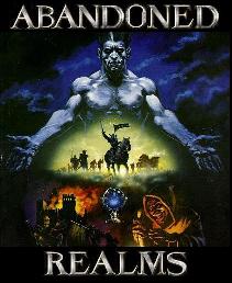
Since I was puttering around on the website anyway, I saw the banner is also very decrepit/pixelly looking so I put together a few using fotor.com and some stock photos from pexel.com (you can click on them for full size):
AR_red.jpg

AR_red2.jpg

AR_white.jpg

AR_white2.jpg

AR_blue.jpg

AR_gold.jpg

Thoughts?
Last edited by Vanisse on Thu Jan 05, 2017 2:26 pm; edited 1 time in total |
|
| Back to top |
|
 |
DigitalText
Joined: 29 Jun 2016
Posts: 88
|
| Posted: Thu Jan 05, 2017 9:01 am Post subject: |
|
|
| I'm torn between AR_red, AR_white and AR_blue. If AR_white2's text were in AR_blue's backdrop, that'd tip the scales for me. If it's an as-is offer, AR_white stands out the most to me. |
|
| Back to top |
|
|
Merlandox

Joined: 31 Mar 2016
Posts: 264
|
| Posted: Thu Jan 05, 2017 10:11 am Post subject: |
|
|
| btw, there is no selection for us to vote for the gold banner? |
|
| Back to top |
|
|
tayyah
Joined: 20 May 2011
Posts: 597
|
| Posted: Thu Jan 05, 2017 11:38 am Post subject: |
|
|
| To me all of them look like the wording looks out of place, except for the last one, so that is my choice, but there isn't an option for gold, so I picked leave as is. |
|
| Back to top |
|
|
Nycticora

Joined: 09 Feb 2013
Posts: 2277
|
| Posted: Thu Jan 05, 2017 12:44 pm Post subject: |
|
|
we have professionally produced art assets here: http://abandonedrealms.com/assets/images/
are they not acceptable? We spent a lot of time and effort on them |
|
| Back to top |
|
|
Vanisse
Immortal
Joined: 06 Jan 2006
Posts: 2793
Location: inside a tree
|
| Posted: Thu Jan 05, 2017 2:09 pm Post subject: |
|
|
Oh. Didn't see those. If we have them why are we using the blob that is there right now? sigh
...well. |
|
| Back to top |
|
|
Vanisse
Immortal
Joined: 06 Jan 2006
Posts: 2793
Location: inside a tree
|
| Posted: Thu Jan 05, 2017 2:26 pm Post subject: |
|
|
Just tried the banners from /assets and they're not quite big enough to fit the space. Is there any way we can get a bigger version?
The two versions of big banners we have:
arches

mountains

(By the way I think our ad button on TMS disappeared)
I updated the poll with gold. I kind of like real mountains in the picture though those floaty arches are neat too. I also don't mind moving the text around on the other banners. I picked mountains, because the current banner has mountains, and then added combos of font and color that seemed to fit - to me, red was for the pk aspect, gold was for the adventure aspect, the white/blue fadey ones were playing on the concept of "abandoned realms" like some place emerging from the mists of time haha. Originally I just had the red white and blue options and then figured I should make an option that fits with the gold color scheme of the rest of the website. |
|
| Back to top |
|
|
Nycticora
Joined: 09 Feb 2013
Posts: 2277
|
| Posted: Thu Jan 05, 2017 4:14 pm Post subject: |
|
|
it may be easier/better to reconfigure the space than it would be to design a new logo. YMMV, the end choices are up to you if you're doing the work. I suck at this stuff.
At one point we were going to convert the website to wordpress or something but I lost track of who was working on that.
I allowed TMS to lapse, it wasn't paying dividends. I don't even bother to vote anymore. We had more noobs last month than we have had in awhile with no ads and we weren't even on the first page of TMS. I think TMS is a dead site. |
|
| Back to top |
|
|
Vanisse
Immortal
Joined: 06 Jan 2006
Posts: 2793
Location: inside a tree
|
| Posted: Thu Jan 05, 2017 4:29 pm Post subject: |
|
|
I saw somebody who had AR wordpress stuff on github haha. I put up a couple of banners for tests (our top votes are blue and gold thus far) and this is how it looked
Gold

Blue

obviously whatever option would need some rearrangement and alignment but it looks pretty nice imo, also looked nice on mobile when I checked it. I'll leave gold up for half an hour if anyone wants to look - it's better resolution than the crappy screenshot I have here. |
|
| Back to top |
|
|
Nycticora
Joined: 09 Feb 2013
Posts: 2277
|
| Posted: Thu Jan 05, 2017 4:55 pm Post subject: |
|
|
| I like the gold banner more but it looks like blue fits the site better. I don't think either of them fit as well as the one we have now, and I think the commissioned banners are significantly higher quality |
|
| Back to top |
|
|
Vanisse
Immortal
Joined: 06 Jan 2006
Posts: 2793
Location: inside a tree
|
| Posted: Thu Jan 05, 2017 5:02 pm Post subject: |
|
|
| I would use the commissioned banners if there was a good way to resize them without losing resolution... the largest we have is 720x90px which is tiny (vertically speaking). I think those were originally designed for ads not for website headers. If I reorganize the header to fit that banner it would make things look very cramped. |
|
| Back to top |
|
|
Vinther
Joined: 30 Dec 2016
Posts: 47
|
| Posted: Thu Jan 05, 2017 6:28 pm Post subject: |
|
|
| to be honest they all look from year 2000, could use some more modern design or the game looks deprecated at first sight. |
|
| Back to top |
|
|
Vevier
Immortal
Joined: 23 Jul 2008
Posts: 1642
Location: everywhere
|
| Posted: Thu Jan 05, 2017 10:41 pm Post subject: |
|
|
| Our banner should be a text description of a banner. |
|
| Back to top |
|
|
Davairus
Implementor
Joined: 16 Jan 2004
Posts: 10368
Location: 0x0000
|
| Posted: Thu Jan 05, 2017 10:47 pm Post subject: |
|
|
| ^ thats the best suggestion so far |
|
| Back to top |
|
|
Nycticora
Joined: 09 Feb 2013
Posts: 2277
|
| Posted: Thu Jan 05, 2017 11:01 pm Post subject: |
|
|
I dig it
Last edited by Nycticora on Thu Jan 05, 2017 11:05 pm; edited 1 time in total |
|
| Back to top |
|
|
Nycticora
Joined: 09 Feb 2013
Posts: 2277
|
| Posted: Thu Jan 05, 2017 11:05 pm Post subject: |
|
|
example banner
load obj 8630
You have created a banner of blood!
exam banner
This unholy banner has been created from the disemboweled entrails and
lungs of the brave few that were foolish enough to attempt to vanquish the
Lord Sheundan. The pieces of flesh have been crushed into a pulp leaving
little more than a dry smear of blood lying before you.
It is made of blood and weighs 4 lbs. |
|
| Back to top |
|
|
Ceridwel
Immortal
Joined: 01 Feb 2008
Posts: 3388
Location: Seattle
|
| Posted: Fri Jan 06, 2017 3:28 am Post subject: |
|
|
| The way it is showing now in my browser is Left-aligned, with the voting buttons all the way left, and my forum account name in the center-top. Is this intended? |
|
| Back to top |
|
|
Vanisse
Immortal
Joined: 06 Jan 2006
Posts: 2793
Location: inside a tree
|
| Posted: Fri Jan 06, 2017 3:49 am Post subject: |
|
|
http://abandonedrealms.com/indextest2.php
Haha. Too long but it was funny to make.
PS sorry everyone about the funky alignment today, forgot to make a copy of the .css file. It should be fine now (hard refresh if needed)
Last edited by Vanisse on Fri Jan 06, 2017 6:27 am; edited 1 time in total |
|
| Back to top |
|
|
grant
Joined: 22 May 2014
Posts: 86
Location: Seattle, Washington
|
| Posted: Fri Jan 06, 2017 6:17 am Post subject: |
|
|
That's friggin incredible, Vanisse. Thank you.
I laughed my ass off. |
|
| Back to top |
|
|
Andrael

Joined: 15 Jan 2013
Posts: 779
|
| Posted: Fri Jan 06, 2017 6:09 pm Post subject: |
|
|
| I LOVE IT! |
|
| Back to top |
|
|
|